Fanta unveils bubbly global branding
Illustrations and typography enhance the soft drink’s first global brand identity, which aims to bring consistency to its designs around the world
Fanta has joined the legions of soft drinks brands unveiling a new look as of late, including PepsiCo’s Pepsi and 7Up in the last six weeks alone.
The redesign for Fanta, which is owned by the Coca-Cola Company, marks the brand’s first effort to create a consistent design system across all of its markets around the world.
The new identity and packaging design were both led by the Coca-Cola Global Design team in collaboration with Jones Knowles Ritchie (JKR), which is fresh from launching a new look for Stella Artois.


The new logotype is a fairly subtle evolution of the previous iteration launched in 2017. The letterforms are slightly more even now, but they’re still extruded and staggered as they were before, and blue continues to play an important role, though the shade has been newly tweaked.
A new custom typeface has also been developed with type foundry Colophon, which has just the right amount of wonky angles and proportions.

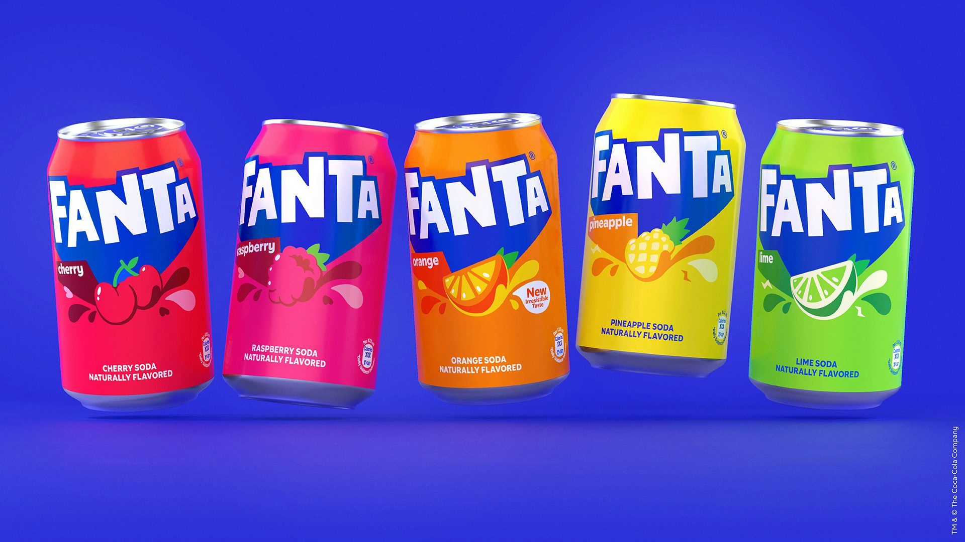
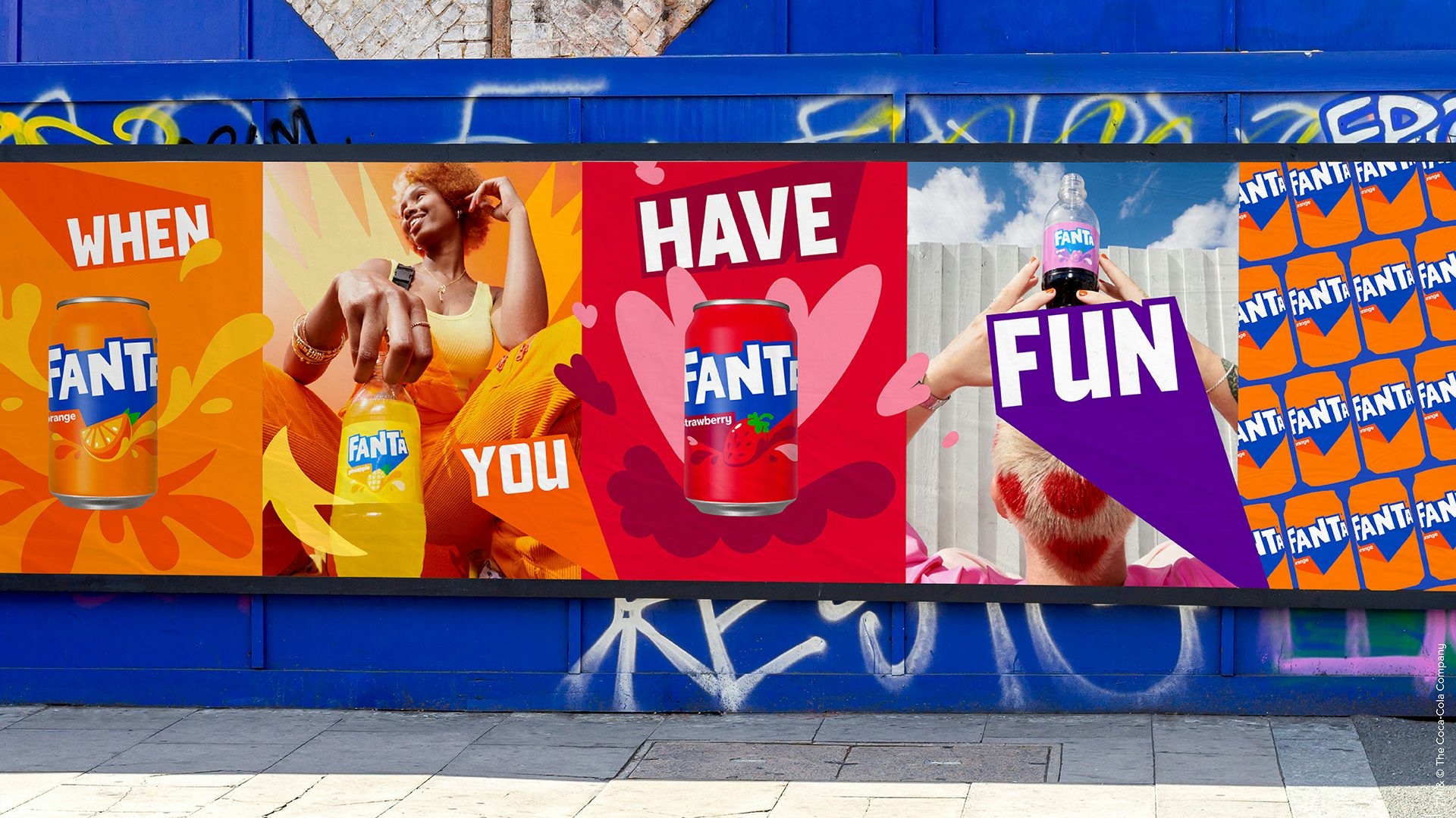
The most noticeable change to the wordmark is the loss of the orange motif and leaf, presumably so that people don’t just associate the brand with its well-known orange flavour.
The expanded colour palette was chosen to drive home the different options in the Fanta line-up, reinforced by a series of fruity graphics indicating the various flavours that appear on the cans. The suite of fruit symbols seen throughout the visual identity are complemented by Lucas Wakamatsu’s joyful illustrations, which work particularly well when animated.


“We were really inspired by the idea of bringing playfulness to consumers of all ages when we started to ideate around how to bring the brand’s purpose to the masses,” said JKR’s global ECD, Lisa Smith.
“By thinking what this meant for the brand’s expression, attitude, and actions, we were able to build a distinctive brand identity that signalled Fanta’s commitment to fun at every level – from real life to digital.”