Netflix releases updated graphic toolkit created by Koto
The streaming platform has released a revised product and brand system inspired by the world of cinema to create a more cohesive experience for users
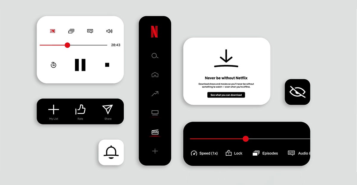
Following on from Netflix’s superbowl ad that promises to show more EVs in its programmes to normalise them, the streaming platform has now released an updated graphic toolkit that connects iconography, typography and illustration.
Created by Koto, the team built on the existing system but wanted to steer clear of the “over-saturated, over-done, one-dimensional” approach often seen in the tech and streaming space.

Instead, Koto has referenced effects and techniques echoed in the film-making process, for instance the simple white icons being set in a ‘widescreen’ format. The spot illustrations and animations have been created in collaboration with Gica Tam and Michael William Lester at Beginners.
Set against a black backdrop, the illustrations are cast in a cinematic palette of rich magentas, cobalts and emeralds and depict a variety of abstract everyday things to be used across their comms in various ways.

As Netflix users watch the platform on a range of different screens, it was important to consider consistency. So the system also includes varying type weights and sizes of the brand’s bespoke typeface, Netflix Sans. This helps with legibility and can easily be adapted for different kinds of signposting on the platform.
The illustrations, icons and typography all come together to create a toolkit that speaks to film enthusiasts and is “instilled with moments of joy”, all the while aiming to create a more cohesive experience for the user.